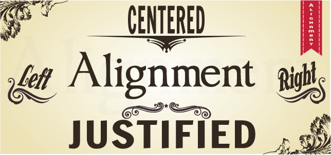
Type Alignment
Flush Left
In typography, a serif is the little extra stroke found at the end of main vertical and horizontal strokes of some letterforms. Serifs fall into various groups and can be generally described as hairline (hair), square (slab), or wedge and are either bracketed or unbracketed.
Hairline serifs are much thinner than the main strokes. Square or slab serifs are thicker than hairline serifs all the way up heavier weight than the main strokes. Wedge serifs are triangular in shape. Unbracketed serifs attach directly to the strokes of the letterform, sometimes abrubtly or at right angles. Bracketed serifs provide a curved transition between the serif and the main strokes. Within these divisions serifs can be blunt, rounded, tapered, pointed, or some hyrid shape. Some special serif-like character parts are spurs and beaks.
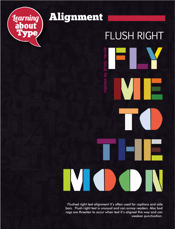
Flush Right
Sans-serif fonts are more often used in headlines, headings, and shorter pieces of text and subject matter requiring a more casual feel than the formal look of serifed types. While in print, serif fonts are considered more readable, sans-serif is considered more legible on computer screens. Most web pages employ sans-serif type for this reason.
Before the term "sans-serif" became standard in English typography, a number of other terms had been used. One of these outmoded terms for sans serif was gothic, which is still used in East Asian typography and sometimes seen in font names like Century Gothic. Sans-serif fonts are sometimes, especially in older documents, used as a device for emphasis, due to their typically blacker type color and a distinct visual appeal.
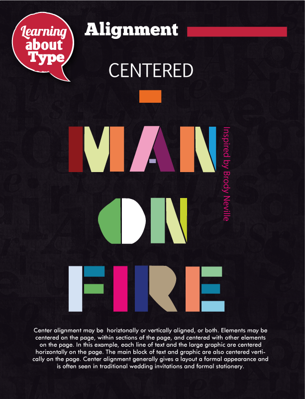
Centered
Before the term "sans-serif" became standard in English typography, a number of other terms had been used. One of these outmoded terms for sans serif was gothic, which is still used in East Asian typography and sometimes seen in font names like Century Gothic. Sans-serif fonts are sometimes, especially in older documents, used as a device for emphasis, due to their typically blacker type color and a distinct visual appeal.
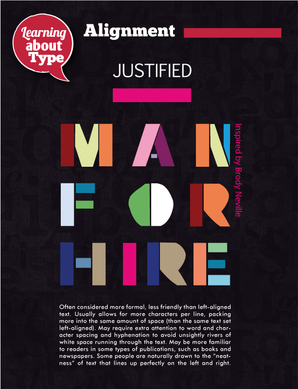
Justified
Before the term "sans-serif" became standard in English typography, a number of other terms had been used. One of these outmoded terms for sans serif was gothic, which is still used in East Asian typography and sometimes seen in font names like Century Gothic. Sans-serif fonts are sometimes, especially in older documents, used as a device for emphasis, due to their typically blacker type color and a distinct visual appeal.