

Good and bad design is everywhere. Good design and use of typography will draw a viewer’s attention to the content and will help your audience understand the message you are trying to communicate. It needs to be readable and that is why typography plays a huge part. In this article, we will understand when a design is good or bad?
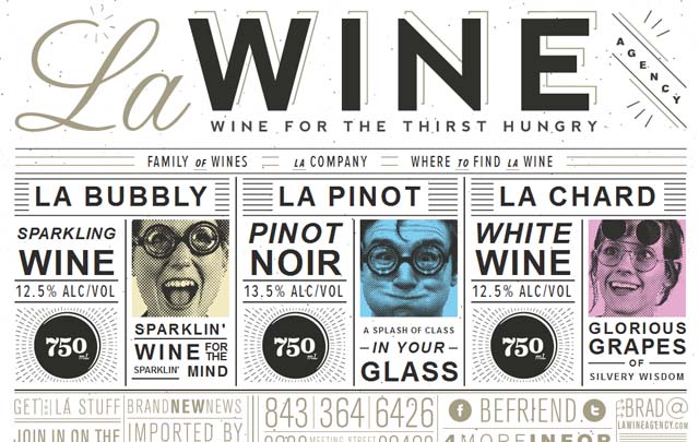
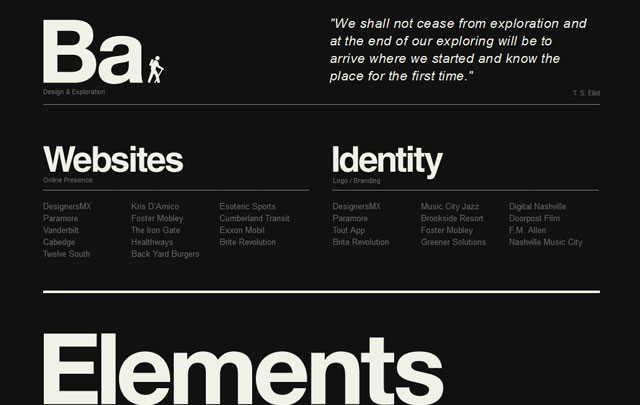
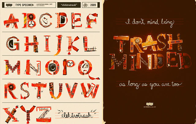
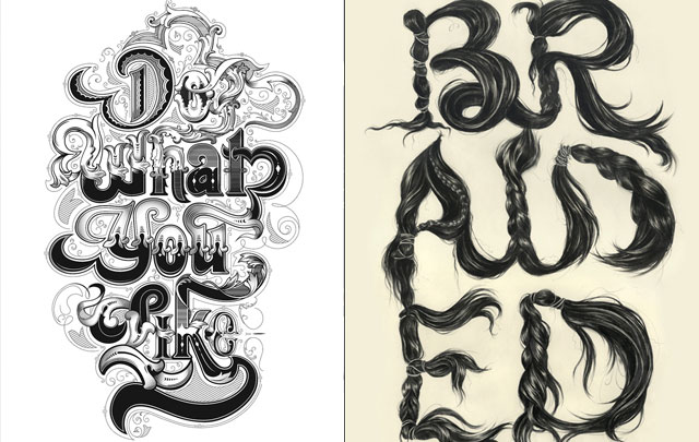
Usually good design will be composed of "form and function". This guideline places importance on a designer’s ability to combine both message and design into one well composed design. The “Form follows function” should be seen as a merriment of the two. This is why typography is so important to design. It is not just a following act to illustrations and graphics. With typography, designers can create a successful composition to create a powerful message.
Form follows function – that has been misunderstood. Form and function should be one, joined in a spiritual union.
Frank Lloyd Wright
Designers must have a clear understanding of contrast, proportion, flow, hierarchy, consistency, balance, grids, movements, usability, space, color, typography, composition, meaning and emotion in order to create a successful composition. A good design will express a message in a memorable way to the audience in any visual communication project.
Bad Graphic Design does the total opposite of good design. Bad design doesn’t capture effective use of typography, colors, and aesthetics in anyway. It is most likely dull, boring and unremarkable. I understand that some designers believe that you can’t judge the quality of their work because it is subjective and people have different opinions of what they like or don’t like. I obviously don’t agree with that statement.
Bad design it's not about what I like or don’t like but about following form and function. Does the message you are trying to make in your composition make sense or is it vague? Is it clear to read? Does it motivate any form of action or emotion? These are questions a designer has to ask themselves when creating work for their target audience.